TethysDash: Creating Custom Plugins
This tutorial picks up where TethysDash: Creating Dashboards left off. You will extend the dashboard from Part 1 by connecting the map's comid attribute to a new variable input, then adding a GeoGLOWS forecast plot that updates whenever the user clicks a river segment on the map.
Objectives
- Understand the TethysDash plugin API by reading a real example
- Connect a map attribute to a variable input so clicks write to dashboard state
- Add the GeoGLOWS Forecast Plot either as a Grid Item on the dashboard, or as a Popup Modal that opens on river click
Prerequisites
- Complete TethysDash: Creating Dashboards. You should have a dashboard named GEOGLOWS Demo that contains a Map of Chinese GEOGLOWS flowlines and a Base Map variable input.
- A local installation of TethysDash, see Installation and Setup — TethysDash.
- The tethysdash_examples plugin package must be installed as a TethysDash dependency. It provides the
GeoGLOWS Forecast Plotvisualization used in this tutorial.
Install the prerequisites
Change into the tethys-workshop directory you created in the Introduction and activate your virtual environment:
Linux / macOS:
cd tethys-workshop  # if you are not already there
source ./tethys/bin/activate
Windows:
cd tethys-workshop  # if you are not already there
.\tethys\Scripts\activate
Your prompt should now start with (tethys). Install TethysDash from PyPI and run the one-time setup command:
pip install tethysdash
tethysdash setup
Then clone the tethysdash_examples repository and install it in development mode so the GeoGLOWS Forecast Plot visualization is available in your local TethysDash:
git clone https://github.com/FIRO-Tethys/tethysdash_examples.git
cd tethysdash_examples
pip install -e .
cd ..
Finally, start the local TethysDash development server:
tethysdash start
A browser tab should open automatically. If it does not, you can access TethysDash at http://127.0.0.1:8000/apps/tethysdash/. Log in with the default credentials:
- Username:
admin - Password:
pass
Steps
Step 1 — Edit the dashboard
Open your GEOGLOWS Demo dashboard and click the Edit (pencil) icon in the toolbar to enter edit mode.
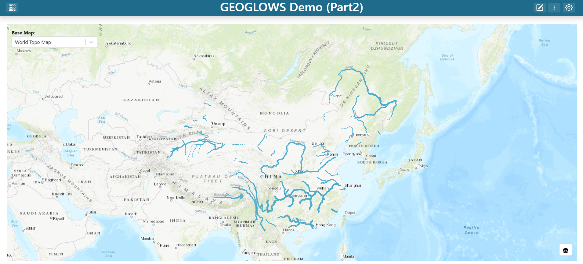
Step 2 — Edit the map layer
- Find the map grid item, click its three-dot menu, and click Edit.
- In the map editor's Layers list, click the China Flowlines layer to open the layer editor.
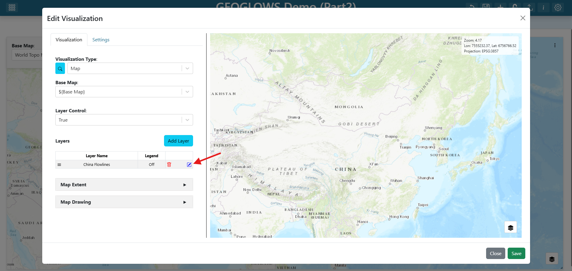
Step 3 — Connect comid to a river_id variable input
- Switch to the Attributes/Table Popup tab in the layer editor.
- Find the
comidrow. - Set its Alias to "River ID".
- Set its Variable Input Name to
river_id.
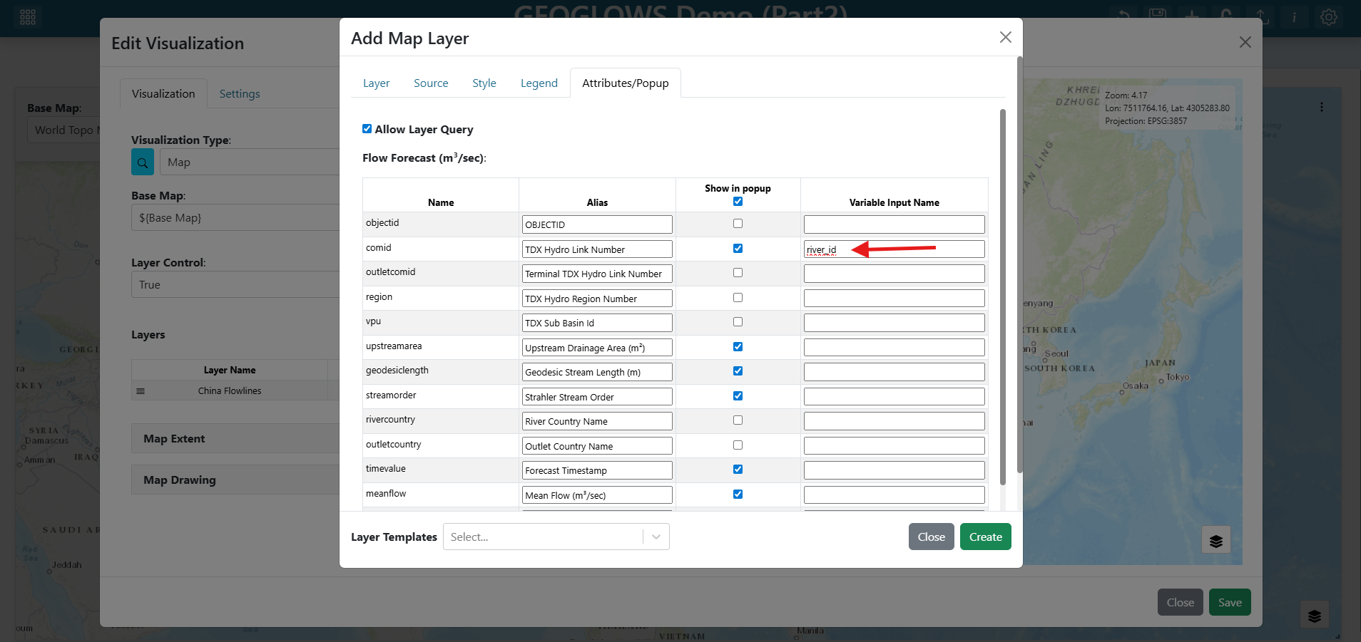
Setting a variable input name on an attribute means: whenever a user clicks a feature on the map, that feature's value for this attribute is written to the named variable input. Any visualization that references
${river_id}will then re-fetch with the new value. This is used in the Grid Item path below. In the Popup Modal path the popup instead uses${feature.comid}directly, so the variable input binding is optional — but setting it costs nothing and keeps both paths open.See Attributes and Popups for the full reference on attribute aliases and click-to-variable bindings.
- Click Create at the bottom of the layer editor.
- Click Save at the bottom of the map editor.
Step 4 — Inspect the GeoGLOWS Forecast Plot plugin
The visualization you are about to add is provided by a TethysDash visualization plugin — an external Python package that subclasses TethysDashPlugin and is auto-discovered when installed alongside TethysDash. The Plugins page is the full reference for the plugin API: every supported type, every args field type, send_update, packaging, and discovery.
Here is the full source for the GeoGLOWS Forecast Plot plugin from the tethysdash_examples repository:
from tethysapp.tethysdash.plugin_helpers import TethysDashPlugin
import requests


class GeoGLOWSForecastPlot(TethysDashPlugin):
    name = "geoglows_forecast_plot"
    group = "Tutorials"
    label = "GeoGLOWS Forecast Plot"
    type = "plotly"
    tags = [
        "example",
        "plotly",
        "tutorial",
        "geoglows",
    ]
    description = "A GeoGLOWS forecast plot for the GeoGLOWS tutorial"
    args = {"river_ID": "number"}

    def run(self):
        self.send_update("Loading forecast data from GeoGLOWS API...")
        url = f"https://geoglows.ecmwf.int/api/v2/forecast/{self.river_ID}?format=json"
        response = requests.get(url)
        forecast_data = response.json()

        self.send_update("Processing forecast data...")
        data = [
            {
                "type": "scatter",
                "x": forecast_data["datetime"],
                "y": forecast_data["flow_uncertainty_lower"],
                "name": "Lower Uncertainty",
                "line": {"color": "lightblue"},
            },
            {
                "type": "scatter",
                "x": forecast_data["datetime"],
                "y": forecast_data["flow_uncertainty_upper"],
                "name": "Upper Uncertainty",
                "line": {"color": "lightblue"},
                "fill": "tonexty",
                "fillcolor": "lightblue",
            },
            {
                "type": "scatter",
                "x": forecast_data["datetime"],
                "y": forecast_data["flow_median"],
                "name": "Median Forecast",
                "line": {"color": "darkblue"},
            },
        ]

        layout = {
            "title": f"GeoGLOWS Forecast ({self.river_ID})",
        }

        config = {"displayModeBar": True}

        return {"data": data, "layout": layout, "config": config}
Key things to understand before wiring the plugin into the dashboard:
| Attribute | Value | What it means |
|---|---|---|
name | "geoglows_forecast_plot" | Unique identifier written into the dashboard JSON's source field |
label / group | "GeoGLOWS Forecast Plot" / "Tutorials" | How the plugin appears in the Visualization Type dropdown |
type | "plotly" | TethysDash renders run()'s return value as a Plotly figure |
args | {"river_ID": "number"} | Declares a single numeric input; TethysDash auto-renders a form field for it |
The run() method fetches the forecast for self.river_ID from the GeoGLOWS REST API, builds three Plotly traces (lower-uncertainty band, upper-uncertainty band, and median forecast), and returns them in the standard Plotly figure shape. The self.send_update(...) calls stream progress messages back to the dashboard over WebSocket while run() is in flight, so the user sees status instead of a silent spinner.
Choose how to display the forecast plot:
- Grid Item
- Popup Modal
Step 5 — Add a new dashboard item
Click the + (Add Dashboard Item) icon in the toolbar. A new empty grid item appears on the dashboard.
Step 6 — Configure the GeoGLOWS Forecast Plot
- Find the new grid item, click its three-dot menu, and click Edit.
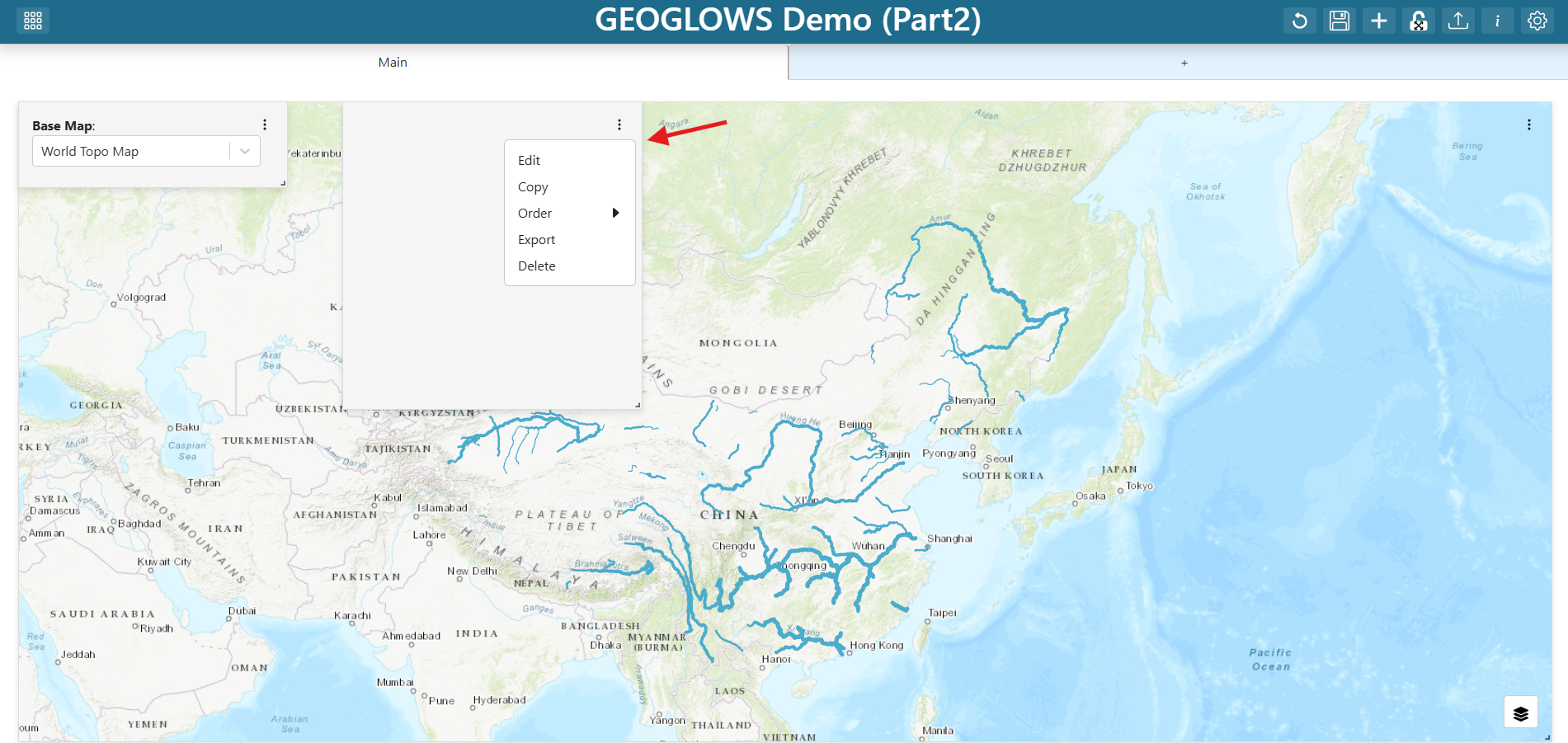
- Set the Visualization Type to
GeoGLOWS Forecast Plot(under the Tutorials group). - Set the plot's properties:
- River ID:
${river_id}
- River ID:
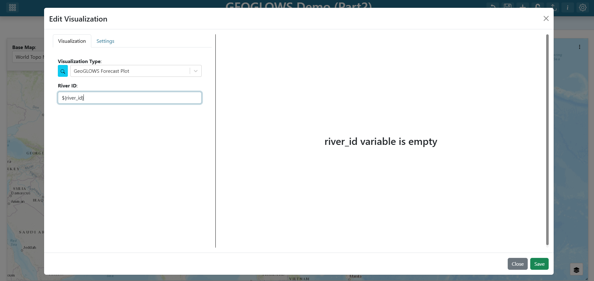
The ${river_id} template tells the plot to read from the variable input you connected to the map. When the user clicks a river segment, the plot re-fetches the forecast for that segment's comid.
Step 7 — Configure the plot's settings
Until the user clicks a river, river_id has no value. Configure a friendly placeholder so the plot does not look broken, and set a background color so the plot stands out from the map.
- Switch to the Settings tab in the visualization editor.
- Under On Any Empty Variable, enter:
Click on a river to see the GeoGLOWS forecast - Set the Background Color to
#dbdbdb(light grey).
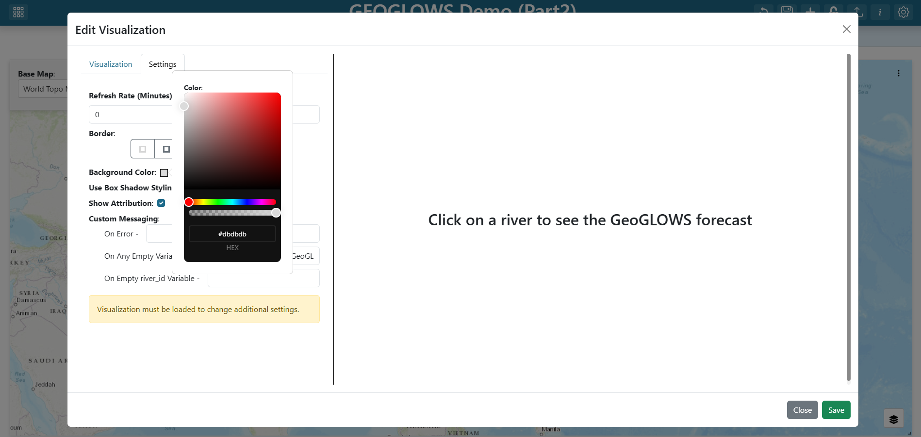
See Dashboard Visualizations for every option in the visualization Settings tab.
Step 8 — Save the item
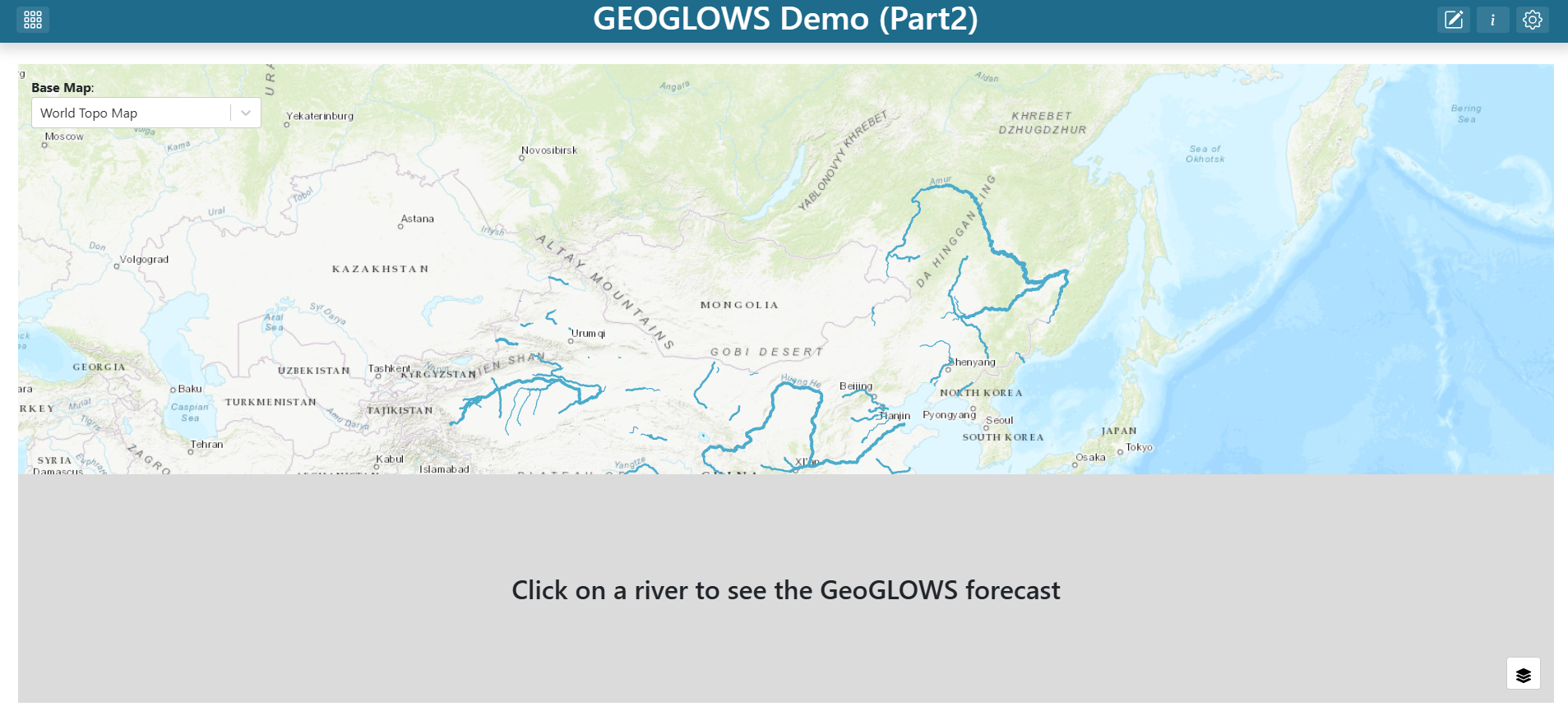
Click Save at the bottom of the visualization editor. The new grid item now renders the placeholder message.
Step 9 — Resize and place the plot
Drag the bottom-right corner of the new grid item to resize it. A common layout is to place the plot below the map spanning the full dashboard width so the forecast is easy to read at a glance.
Step 5 — Enable Custom Popup Modal on the layer
Custom floating popup modals are a great way to show contextual information without taking up permanent dashboard real estate. In this approach, the GeoGLOWS Forecast Plot only appears when the user clicks a river segment, and it floats on top of the map instead of being embedded in the grid.
- Find the map grid item, click its three-dot menu, and click Edit.
- In the map editor's Layers list, click the China Flowlines layer to open the layer editor.
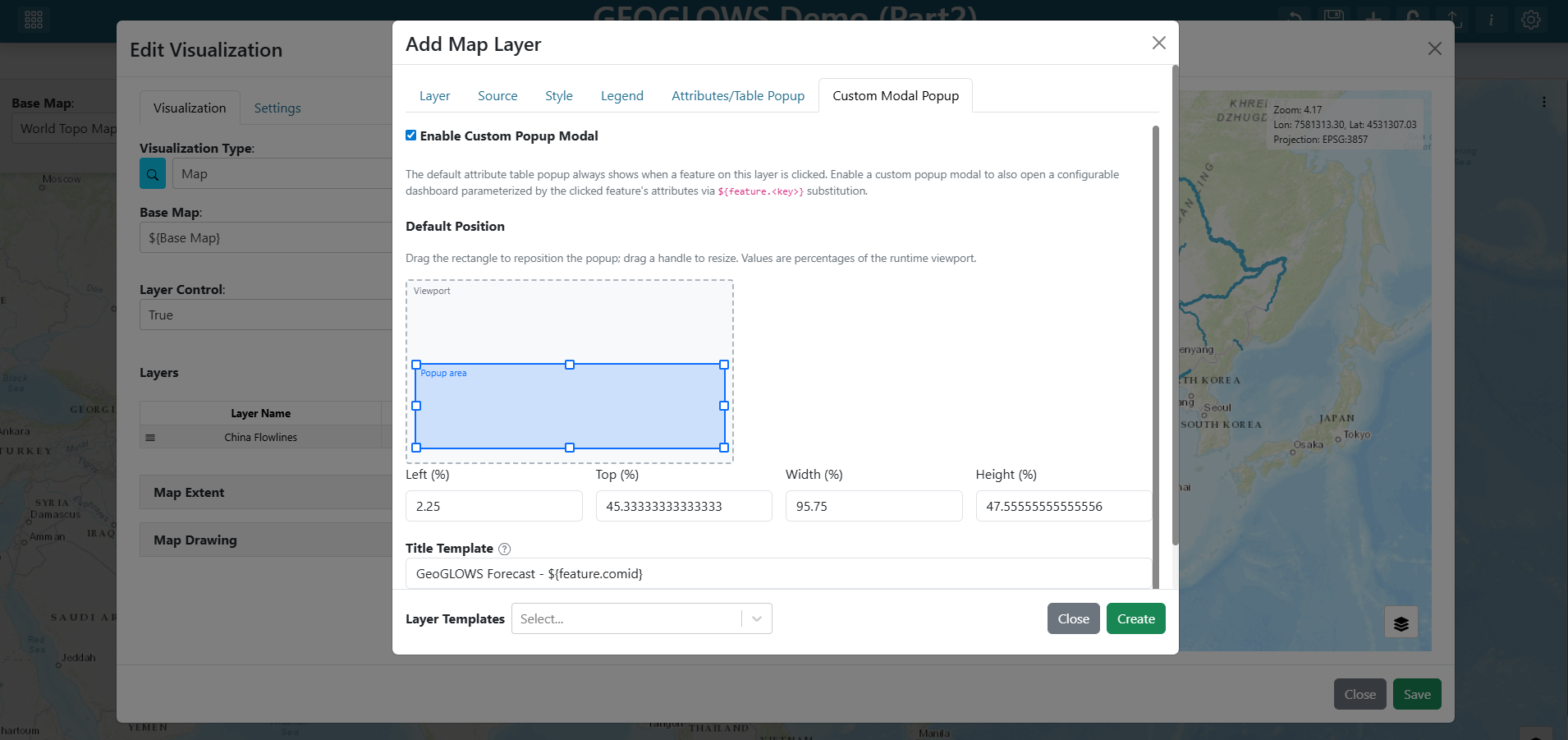
- Switch to the Custom Modal Popup tab.
- Check the Enable Custom Popup Modal checkbox.
- Set the Title Template to:
GeoGLOWS Forecast — ${feature.comid}
The ${feature.comid} token is replaced at runtime with the comid of whichever river segment the user clicked.
- Leave the Default Position at the default (60 × 60%, centered) or drag the canvas rectangle to reposition and resize the modal.
Step 6 — Add the forecast plot to the popup layout
Click Edit popup layout. A mini-dashboard editor opens — this is the content that appears inside the modal when the user clicks a river.
- Click + (Add Visualization) in the mini-dashboard toolbar.
- Find the new grid item, click its three-dot menu, and click Edit.
- Set the Visualization Type to
GeoGLOWS Forecast Plot(under the Tutorials group). - Set the plot's properties:
- River ID:
${feature.comid}
- River ID:
Inside the popup layout, use
${feature.<key>}to reference the clicked feature's attributes. This is different from the${river_id}variable input substitution used on the main dashboard.${feature.comid}resolves to thecomidof whichever river segment was clicked.
- Click Save on the visualization editor.
- Resize the plot grid item to fill the popup area.
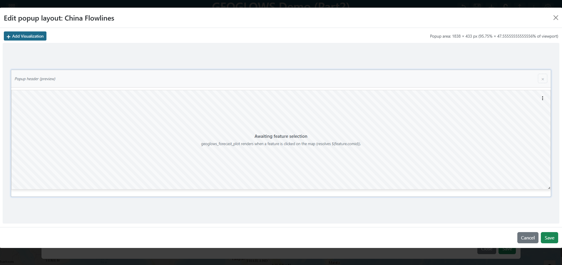
- Click Save to close the popup layout editor.
Step 7 — Save the layer and map
- Click Create at the bottom of the layer editor.
- Click Save at the bottom of the map editor.
Step 5 — Save the dashboard
Click the dashboard Save (disk) icon in the toolbar to persist your changes.
Try it out
Exit edit mode and zoom in on the map past zoom 12 until the flowlines render.
- Grid Item
- Popup Modal
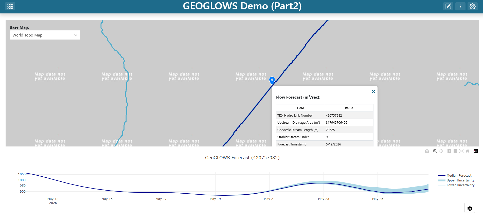
Click any river segment in China — the GeoGLOWS Forecast Plot grid item should immediately re-render with the forecast for that comid. Click a different segment and the plot updates again.
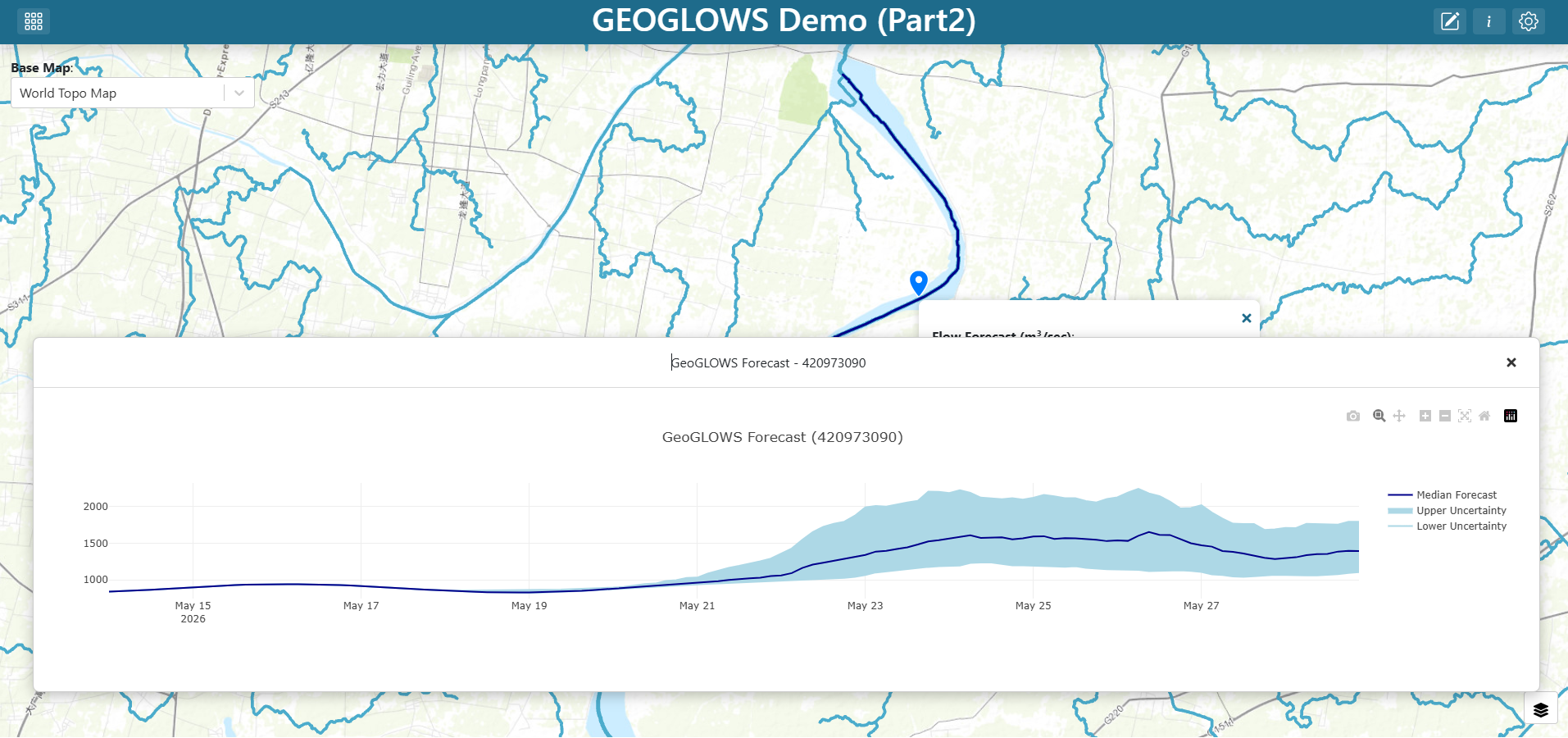
Click any river segment in China — a floating popup modal should appear over the map showing the GeoGLOWS forecast for that segment's comid, with the title GeoGLOWS Forecast — <comid>. Close the modal with the × button and click a different segment to confirm the title and chart update.
Solution
Download and import the completed dashboard: GEOGLOWS_China_TethysDash_Part2.json
This file can be imported into TethysDash via the Import Dashboard button on the landing page. It matches the Grid Item version built in this tutorial.